<h1> H1. Bootstrap heading </h1><p class="display-1"> Display 1 </p>Display 1
Display 2
Display 3
Display 4
Display 5
Display 6
<a href="#" class="btn btn-primary"> Primary </a><a href="#" class="btn btn-primary rounded-pill"> Primary </a><a href="#" class="btn btn-outline-primary"> Primary </a><a href="#" class="btn btn-outline-primary rounded-pill"> Primary </a><a href="#" class="btn btn-primary btn-sm"> Primary </a><div class="alert alert-primary" role="alert"> A simple primary alert—check it out! </div><div class="alert alert-primary" role="alert"> A simple primary alert with <a href="#" class="alert-link"></a>. </div>Aww yeah, you successfully read this important alert message. This example text is going to run a bit longer so that you can see how spacing within an alert works with this kind of content.
Whenever you need to, be sure to use margin utilities to keep things nice and tidy.
<div class="alert alert-success alert-dismissible fade show" role="alert"> <strong>Well done!</strong> You successfully read this important alert message. <button type="button" class="close" data-dismiss="alert" aria-label="Close"> <span aria-hidden="true"> × </span> </button> </div><div class="alert alert-primary alert-pills" role="alert">
<span class="badge bg-danger rounded-pill"> New </span>
<span class="alert-content"> A Modern primary alert—check it out! </span>
</div><div class="alert alert-outline-primary alert-pills" role="alert">
<span class="badge bg-danger rounded-pill"> New </span>
<span class="alert-content"> A Modern primary alert—check it out! </span>
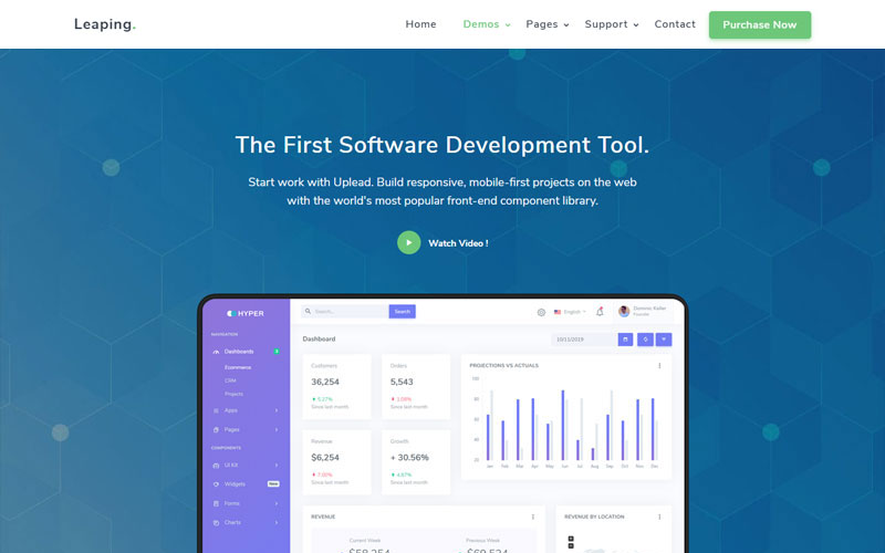
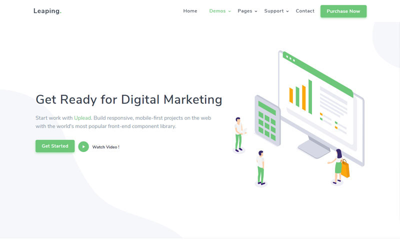
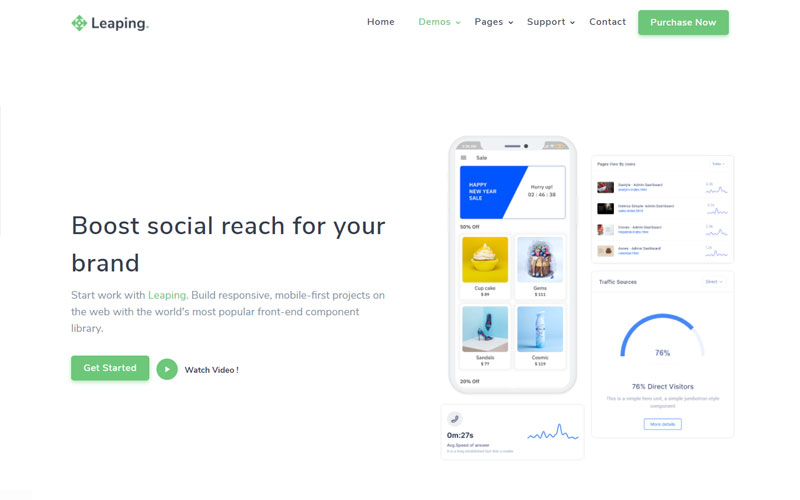
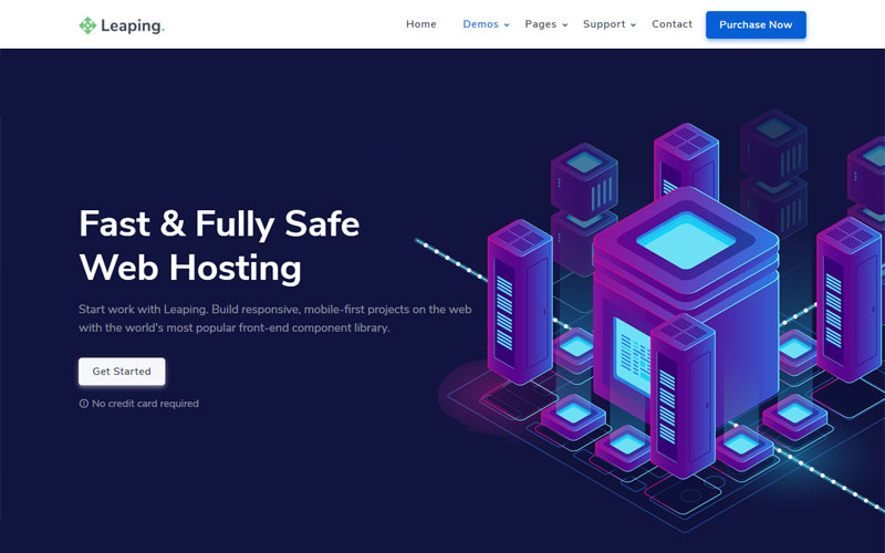
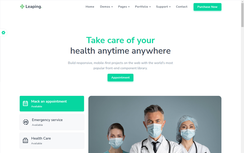
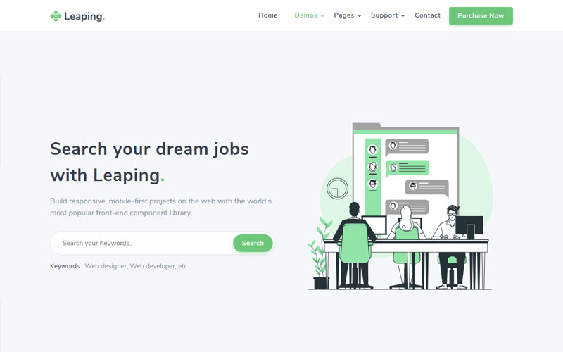
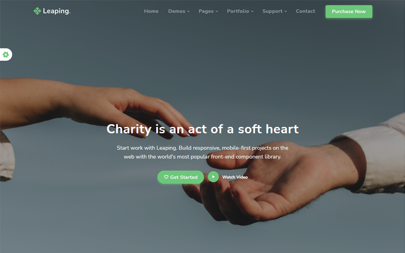
</div><span class="badge bg-primary"> primary </span><span class="badge bg-primary rounded-pill"> primary </span><a href="#" class="badge bg-primary"> primary </a><div class="text-primary"> Leaping Multipurpose Template & UI Kit </div>Start work with Leaping. Build responsive, mobile-first projects on the web with the world's most popular front-end component library.
Start work with Leaping. Build responsive, mobile-first projects on the web with the world's most popular front-end component library.
Start work with Leaping. Build responsive, mobile-first projects on the web with the world's most popular front-end component library.
<img src="images/home/01.jpg" class="img-fluid avatar avatar-small rounded">
<img src="images/home/01.jpg" class="img-fluid avatar avatar-small rounded-pill">
<img src="images/home/01.jpg" class="img-fluid img-thumbnail avatar avatar-small rounded">
There are 4800+ Material Design icons and you can get all icons info from here: https://materialdesignicons.com/
<i class="mdi mdi-home"> </i>